AUTHORS Kim Berndtson A new addition breathes life into this previously petite kitchen, transforming it into an open, multi-purpose room for clients who love to cook and entertain.
Photo Credit | Bearwalk Cinema
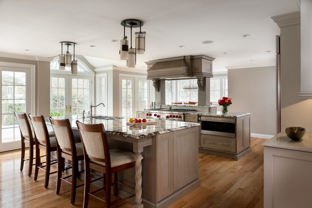
Scituate, MA — A 300-sq.-ft. addition not only tripled the footprint of this kitchen, but also laid the groundwork for its transformation. The small, awkward room with too many angles and too little countertop and storage space was recreated as an open, well-functioning kitchen with dual islands, updated appliances, coffee station, bar area and bonus breakfast nook.
Find the perfect kitchen countertop material and give your kitchen a new look. Granite, Marble, Quartz are the best selections for kitchen countertops.
“My clients bought the home about four years ago and recently finished working with an interior designer to update other rooms,” says Marlene MacDonald Ketchen, owner/designer, The Cabinetry Kitchen & Bath Design Studio, in Hingham, MA, and president of the Bath & Kitchen Buying Group. She collaborated with Meyer & Meyer Architects for the addition.
“It is a beautiful home, but it needed a new kitchen…a place where my clients could cook, entertain and be comfortable,” she states.
However, simply adding square footage wasn’t the be-all, end-all solution, notes Ketchen, who indicates the potentially cavernous space was further complicated by an abundance of windows and openings that left little in the way of wall space for upper cabinet storage. The clients also had an extensive list of appliances they wanted incorporated into the space, creating another challenge.
“We had to get very creative to find enough storage and fit all the appliances,” she explains, noting the end result is a kitchen with sophisticated efficiency…a place where the cooking process is well thought out and where aesthetics are well appointed.
Foundational cooking island
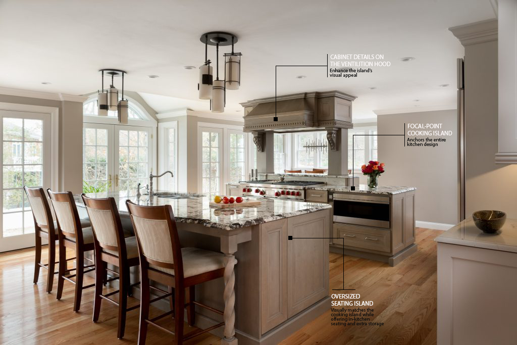
Given their specific parameters, positioning the 48″ Wolf range and its associated ventilation hood became top priority, with their final destination incorporating an existing column that supports the second floor and an additional faux column to offer symmetry.
“[Due to] the range’s size, downdraft ventilation wasn’t possible,” she says. “Plus, my clients wanted a traditional wood hood that matched the cabinetry. Because of the way the addition was done, and because of the way we needed to vent the range, there was really only one place for the range and hood.”
Ketchen built upon the cooking island’s functionality by adding additional appliances, including a Wolf microwave and paneled warming drawer. A pull-out cabinet for spices and cooking oils on one side of the range is balanced by a bank of drawers on the other. Additional storage via shallow cabinets with touch latches is located on the back side of the island, which faces into the breakfast nook. This side of the island also features a gracefully curved raised bar top.
“It gives a nice aesthetic,” the designer notes. “When my clients are entertaining, guests who are standing can also use it as place to set their drinks.”
Ketchen enhanced the island’s visual appeal with the addition of wainscoting and cabinet details, such as corbels and bands of spherical trim, from Omega Cabinetry’s Infinity Collection.
“My clients really loved the circles and wanted to work them into the design,” she explains.
Oversized seating island
With the focal-point cooking island located, Ketchen turned her attention to the second island, which serves as home to the sink and paneled Miele dishwasher. Its oversized dimensions offer plenty of storage – including large drawers for pots and pans – and a place for in-kitchen seating.
“This island needed to be chunkier and ‘heavier’ than a standard 36″ island,” she says, noting it reaches to 60″ at the broadest point along its curved top. “I wanted to use that width to provide more storage and to tighten up the walkways so they weren’t too wide.”
The island’s Omega Cabinetry Dynasty Series base echoes the same Pumice stain as the cooking island. The designer also included Infinity Collection details, such as turned support legs. Additional details include a pair of custom Hubbardton Forge pendant lights that hover above the island and complement the chandelier in the breakfast nook.
Ketchen also tied both islands together visually via their Copenhagen granite tops.
“They fell in love with the stone,” she says. “It’s beautiful and has a lot of movement.”
‘Quiet’ perimeters
To keep the kitchen from becoming too busy, Ketchen suggested a ‘quieter’ stone for the perimeter countertops, including those on each side of the paneled Sub-Zero refrigerator as well as at the coffee station and bar area.
“I often recommend quartz for perimeter countertops, usually something solid if a ‘wild’ grain stone is used on the island,” she notes. “But these clients really wanted natural stone. I helped them search for something complementary and we found this Calacatta quartzite. It really complements the granite and keeps the busy stone from overpowering the space.”
Ketchen also set the perimeters apart from the islands by choosing a creamy white Magnolia paint finish for the maple cabinetry to differentiate it from the Pumice-colored alder islands.
Additional elements in the refrigerator surround include glass upper cabinets with curved mullion details and drawer base cabinets with organized storage accessories, including cutlery dividers and a peg system for dishes. To pull the refrigerator into the space and closer to the islands, Ketchen deepened the wall by adding a tall, narrow pantry with rollouts behind each cabinet that flanks the refrigerator.
“These cabinets bump the refrigerator further into the work triangle,” she says, noting they also offer additional storage. “Without them, the refrigerator would have been too far away from the islands.”
Entertaining extras
The kitchen’s addition gave Ketchen enough space to include a bar area as well as a coffee station. The bar, set at an angle, repeats the curved mullion glass doors and features dual refrigerator drawers and a pass-through that offers a view into the living room. The Calacatta quartzite countertop, which overhangs into the adjoining space, coordinates quietly with elements on both sides.
Ketchen’s clients also wanted to include a tall wine refrigerator. Since the bar couldn’t accommodate the appliance, she incorporated a Sub-Zero unit into the adjacent coffee station, adding an undercabinet ice maker beside it. On the opposite end of the coffee station, Ketchen complemented the wine refrigerator with storage cubes for champagne. In between, the designer added more storage, including dual lift-up garage doors to conceal the couple’s coffee maker as well as their blender and mixer.
“They really wanted a coffee station for entertaining and for when they have overnight guests,” she says, noting that they wanted to give visitors easy access, yet close off the area when not in use.
“My clients were very involved with every inch of their new kitchen,” she continues. “I love customizing a design to get a space just the way a client wants it. And this kitchen really is customized for the way they live…and they love it!”
Source | Kitchen & Bath Design News

